How Altro is leading the way turning theory into best practice as an ambassador for education around inclusive design.
It’s been a decade since flooring and walling manufacturer Altro collaborated with the University of Stirling’s renowned Dementia Services Development Centre (DSDC) to develop colour palettes and non-sparkle finishes for safety flooring to enable safer, better designs in care environments for people living with dementia. From that came best practice guidance and Altro’s RIBA-approved CPD Designing for Dementia, which proved to be hugely popular in the years that followed.
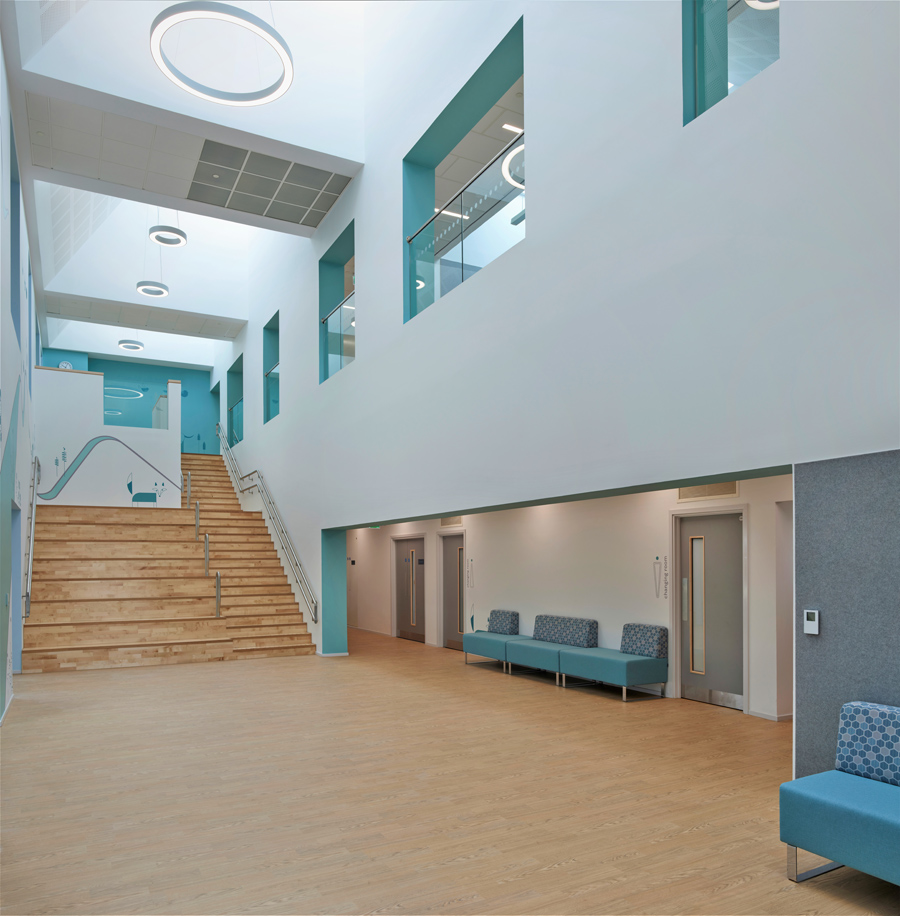
However, over time, it became clear that to focus in on design for dementia only was to overlook the needs of the many other specialist operators in the care sector, as Joe Hurst, Altro’s UK Social Care Key Account Manager, explains. “The care sector is broad with services for adults with learning difficulties, those with autism and other neurodiversity, physical disabilities, young people in independent living facilities, and much more.
“We started talking to people about design for neurodiversity, and looking at inclusive design more widely and realised there is so much more the design community could do to enhance buildings for all those who use them. This really resonates with our core values as a company so we looked at the role we could play in this process of education and sharing best practice.”
From this commitment came Altro’s first hugely successful Forum events which brought together designers and architects to look at a range of topics around design for neurodiversity. From those, and in collaboration with some of the experts involved in the forums, Altro developed their RIBA-approved CPD, Designing for Neurodiversity. This CPD provides an outline of what neurodiversity is, and demonstrates the importance of designing spaces to be inclusive with consideration for the needs of people who are neurodivergent. It also provides practical details of the relevant legislation, standards and guidance to consider when designing inclusive spaces.
To date, Altro’s Designing for Neurodiversity CPD has been delivered to nearly 5,000 architects, designers and estates managers, with extremely positive feedback. “The Designing for Neurodiversity CPD is incredibly popular,” explains Joe. “It focuses on the many practical, often small and straightforward considerations that can be incorporated into building designs to make a huge difference to the wellbeing of those living, working or visiting them. There is so much good practice to pass on around design for neurodiversity.”
Joe and the team knew there was even more work to be done looking at the wider considerations for inclusive design, so they developed another RIBA-approved CPD, Designing with inclusivity in mind. “We always wanted to tell this side of the story too, but there was just so much material that we decided to focus first on neurodiversity, then look more widely at best practice for design for inclusivity.”
Designing with inclusivity in mind was launched in April 2024 and has seen huge uptake, including many who had found Altro’s previous CPDs immensely useful. The CPD sets the scene for diversity and inclusivity in the UK, outlines current guidance and legislation, provides an awareness of the 9 protected characteristics, discusses design considerations and best practice and draws advice from interviews with a team of inclusive design champions from across the UK.
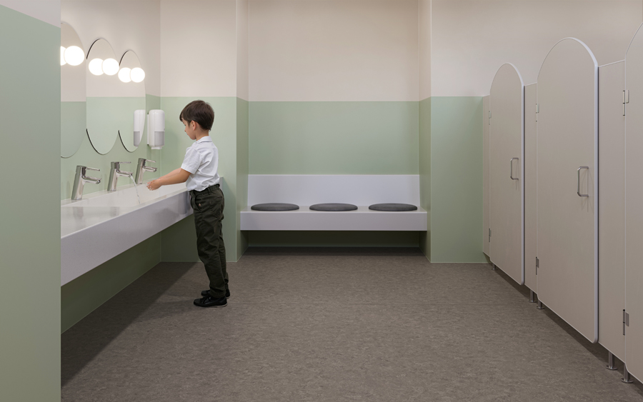
Chroma values: a key consideration for inclusive design
Altro’s close collaboration with architects and designers has led to a move to start to include Chroma values online for its product ranges. Stephanie Kyle, Senior Architect & Inclusive Design Consultant at Floyd Slaski Architects, and recent winner of first ever AJ100 Changemaker of the Year award, explains the significance of that move.
“Many designers are familiar with light reflectance values which essentially indicate how light or dark colour is. Even though some designers may not have lived experience with vision impairment or visual processing differences, using the Light Reflectance Value numbers makes it much easier to improve the accessibility of their colour choices. In the same way that LRVs give designers a way to identify contrast, chroma values give designers a way to identify colour intensity. Chroma is an additional consideration that denotes how saturated a colour is and therefore how intense that colour is. The greyer or desaturated a colour is, the lower the chroma value, the more intense/saturated the colour is, the higher the chroma value.
“The intensity of a colour is also dependent on the hue, with yellow tones generally having higher chroma values than blue tones for example. Choosing a colour with a lower chroma value can help to reduce the intensity of the surface which can be overstimulating for people with sensory processing differences. This doesn't entirely exclude high-chroma colours from the palette. Instead, a tailored palette for each space, taking into account surface area and surrounding materials, should be developed for review with stakeholder groups who have lived experience.
“Colour intensity can be difficult for some designers to recognise so having the chroma values to support colour choices, in the same way Light Reflectance Values assist with contrast, will hopefully improve accessibility for people who have a visual processing difference or are more sensitive to visual stimuli. “
Maria Luigia Assirelli, Director and Mental Health & Social Value Lead at Floyd Slaski Architects, was also involved in updating the colour palette for the popular Altro Whiterock Satins range.
“The introduction of new 'tonal' colours in healthcare design presents the opportunity to further refine and tailor colour palettes to the specific needs of healthcare environments. Tonal colours, which may include subtle variations within a single hue, offer a nuanced approach to colour selection that can enhance the visual interest of a space while maintaining a sense of harmony and tranquillity. By incorporating tonal colours alongside traditional low chroma hues, designers can create dynamic and visually engaging environments that still prioritise the calming effects associated with softer tones.”
Altro has revised and updated its original Designing for Dementia CPD over the years, and also has Designing for Mental Health, both also RIBA-approved. Each seminar is approximately one hour long and is designed to fit flexibly within busy work schedules. To find out more, visit www.altro.com/uk/learn-and-engage/continual-profes...