‘Heart Wood’ revealed as DuluxTrade’s 2018 Colour of the Year, bringing balance and versatility to the built environment
Today, the UK’s leading paint brand Dulux Trade has unveiled its annual Colour of the Year: Heart Wood, a warm neutral, with a hint of heather. The colour has been revealed alongside key colour predictions for 2018 as part of the brand’s industry-acclaimed trend forecast, ColourFuturesTM, now in its 15th year.
Every year, Dulux Trade’s parent company AkzoNobel brings together a panel of international experts from various disciplines of design to develop ColourFutures™, the brand’s industry-acclaimed trend analysis and forecast. The team scours the globe to discover emerging trends and insights and identifies how they impact the way we live. The findings result in the selection of the Colour of the Year and key colour palettes that subsequently present specifiers, from architects to interior designers, with a collection of aspirational colour schemes that can be applied to both residential and commercial projects.
This year, acclaimed architect, interior designer and TV personality Oliver Heath was part of the panel, which is based at AkzoNobel’s Global Aesthetic Centre in the Netherlands. Oliver was key in ensuring that all the subtleties of the industry’s specification needs were threaded into the resulting palettes.
While over the last year, the defining shade, Denim Drift, has been the manufacturer’s third bestselling shade, it is hoped this success can be repeated with Heart Wood, Dulux Trade’s Colour of The Year for 2018.
TRANSLATING THE MOOD OF THE MOMENT INTO TRENDS
For 2018, that mood is felt to be one of unpredictability and uncertainty. A world in which we don’t know what the news will bring every day; a world with more expectations and more demands on our time; a world of division, and a world where we have greater access to information and choices than ever before.
This year’s four key colour palettes include a variety of tones which each complement Heart Wood in different ways, with solutions for residential, leisure and hospitality, commercial spaces and health care facilities. The new Colour of the Year and its associated trends have been created to ensure daily environments can become places of calm; where the noise can be turned down and values can be nurtured. Colour is an essential tool in creating an environment that welcomes people in.
TRENDS OVERVIEW
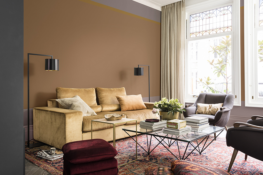
THE COLOUR OF THE YEAR AT THE HEART OF DESIGN – THE HEARTWOOD SPACE
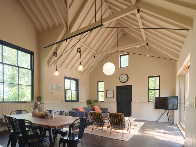
The Heart Wood trend is inspired by the beautifully warm wooden materials we see being used in all kinds of interior decorating and architecture. A variety of woods are growing in popularity, but we see a tendency towards warmer, light and dark shades of red, alongside violet and pinkish woods. The warmth of wood reflects the comfort that we need in these uncertain times – this material is an essential element for creating the welcoming environments we desire.
The Colour of the Year palette reflects the importance of cosy wooden tones and since blue remains so fundamental, the colour collection flows beautifully from this year into next. The nourishing warmth of wood and tactile comfort of leather add to this sense of harmony. There is no need for excess – the ‘Heart Wood’ space has everything needed to create real balance.
The versatility of the palette gives specifiers the freedom to balance softer shades such as cocoa with the deeper, bolder tones of ink blue and purple. Combining these shades in such a way creates a calming backdrop, effectively transforming any space into an environment of comfort and restfulness.
Due to its gentle and delicate character, the palette is perfectly suited to residential, hospitality and leisure projects. It channels the current commercial interest in the colour pink and presents it as an accessible set of nearly-neutrals. The Heart Wood palette works marvelously as a subtle background décor yet is full of character and plays well with popular modern design details such as walnut, brushed brass, marble and matt-black surfaces.
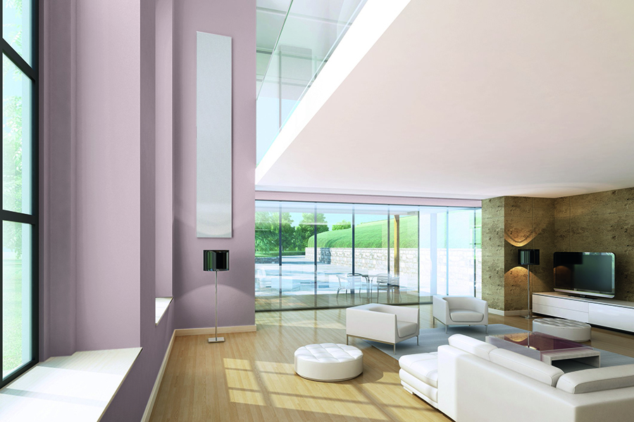
THE COMFORTING SPACE:
This trend is about relaxed, grown-up luxury, with its heritage hints, warm-tone woods and use of natural materials. Creating rich, welcoming interiors with generously layered textures that offer a restorative embrace. Created with architects and interior designers in mind, this palette helps accentuate the best in the architectural details of a building. Such attention to detail greatly enhances the perceived value of a space.
The colours in this palette all have a muted quality, making them easy to combine into a colour scheme of your own or your customer’s choice. In the home it provides an instant impression of luxury as well as a neutral base for residents who want to personalise their surroundings.
For office buildings, the warm nature of this palette creates a welcoming setting. As society’s boundaries between work and home gradually fade, it presents employees with a pleasant workspace, which plays an important part in job satisfaction and productivity.
THE INVITING SPACE:
The Inviting Space colour collection has an easy-going style, bringing together neutrals, softer pastels framed by graphic borders of coal and dark blue. Encouraging a clear-headed approach to life, the palette supports a need for connection, making it well-suited to office spaces as well as healthcare environments.
Proportions of coloured surfaces can be used to indicate the purpose of a room, or signal a transition to a different area. For instance, softer pastel shades may be framed by graphic borders to create an airy mood, yet enhance spatial awareness. Similarly, consecutive rooms painted in several shades of green impart a sense of logic.
THE PLAYFUL SPACE:
The Playful Space palette draws the Colour of the Year, Heart Wood, into sunny and warm territory. Pops of fresh colour add a sense of fun and energy, including shades of green inspired by nature. As the name suggests, the Playful Home brings a sense of possibility to a space. Above all it’s about creating a place for drawing inspiration and creativity. Overall cheerful in tone, the palette is ideal for school buildings as well as the leisure industry.
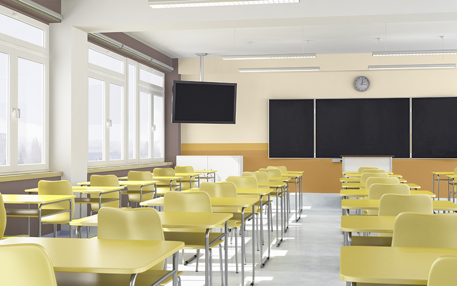
With the Playful Home palette, the mood-enhancing qualities of the palette lend themselves perfectly to the hospitality sector as well as education by creating a space that is invigorating and full of life. Clean and fresh hues combined with uplifting accent colours are essential in providing a stimulating atmosphere, while muted tones can ease tension and improve concentration.
Reflecting on the ColourFuturesTM colours and trends for 2018, Rebecca Williamson, Senior Colour and Design Expert, added:
“Dulux Trade’s colour of the year for 2018, Heart Wood, is incredibly versatile, and connects beautifully with the accompanying trend palettes for the year ahead. Providing the comfort and reassurance we’re all seeking, it’s the perfect antidote to the mood of the moment – channeling a real sense of calm and warmth during such times of uncertainty. We can’t wait to see spaces across the globe transformed into true sanctuaries.”
Dulux Trade incorporates an extensive range of high profile sub-brands that are unparalleled in their decorative performance. These include Diamond, a hard-wearing innovative range of paints incorporating stain repellent technology, which is available in over 11,500 shades, and Weathershield, a specialist range that can help exterior masonry and timber withstand the elements. The Colour of the Year is just one of an extensive portfolio of tools and services available to help specifiers unlock the maximum potential from their spaces.
For more information on Heart Wood and the ColourFuturesTM trends for 2018, visit: www.dulux.co.uk/colourfutures2018.