Dulux Trade has announced the 2017 Colour of The Year as part of the highly anticipated launch of the annual Colour Futures 2017 trend forecast.
The curated trend palettes, which are informed by a global team of experts, align with four key colour stories inspired by an overarching theme of ‘Life in a new light’.
The leading commercial paint brand’s team of global colour and design experts develop the annual forecast based on emerging trends that shape the way people live and work. From interior design and architecture to fashion and beauty, through to social and economic influences; the colour trends inform the evolving landscape of our lives.

International design and colour visionaries at the Dulux Global Aesthetic Center have been scouring the globe for the latest social and trend developments to help them lead the way in colour innovation. The colour experts have used this insight to define the tones and shades that best represent how consumers and end users live their lives in 2017.
This year, the overriding theme celebrates a new outlook on the simple things that make life worth living. In an increasingly digital world where real and authentic experiences are becoming more important than ever before, Dulux Trade is reconsidering the foundations of living to unveil the most important trends in 2017.
Louise Tod from the Dulux Global Aesthetics Centre, responsible for delivering Colour Futures trends and concepts to the trade, says: “As the world changes, people are taking a fresh look at the everyday elements of life – our family and friends, work, connecting with nature, and the pleasure of experiences. We are incredibly excited that ‘Life in a new Light’ is the driving influence for 2017 and is seen in all our colour trends for the year.”
‘Denim Drift’ is the defining colour of 2017. A beautiful, timeless and versatile grey-blue, it is the must-have colour in the worlds of interior design, architecture and for the year ahead. It perfectly captures the mood of the moment and is a true embodiment of the way we’ll live our lives in 2017.
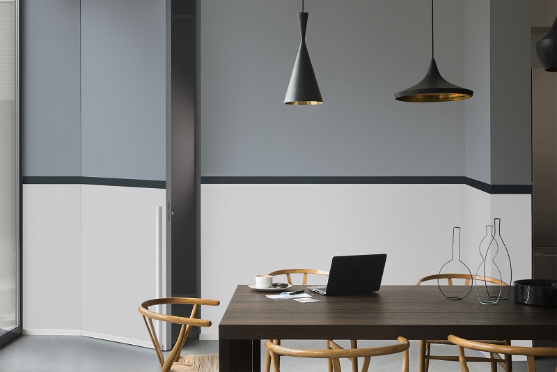
Dulux Trade has developed a beautiful tonal colour palette to complement the Colour of the Year, Denim Drift, featuring a spectrum of blues and complimentary blue-hued tones.
Louise Tod adds: “Blue is known to be the world’s favourite colour, cutting across geographic and cultural boundaries. Creating a blue colour scheme provides commercial specifiers with flexibility in both a residential and commercial setting with hues that run the gamut of being calming to energising. This year the Colour of the Year, Denim Drift, has been teamed with a palette of blues which gives specifiers options for every environment. There is something for everybody whether working the colour into large-scale housing developments, offices or a private residence.
“There are ten blues within the palette, five of them, including Denim Drift, are muted and atmospheric and the remaining five are cleaner, brighter hues that pack more of a punch. The whole collection has been designed to be used in combination across different elements of an interior from the walls to the furniture, furnishings and accessories. You can turn the visual impact up with the brighter blues and down with the muted blues to suit the style and use of a room and can be sure that none of them will ever look out of place.”
As the world becomes more passionate and vocal about issues surrounding the environment, this trend reflects our inclination to living sustainably. We are all connected to nature and yet we live in an overwhelmingly urban and digital world. Although this trend comes from a place that is deeply considered, it can be translated easily into spaces that immerse the user in the natural world.
Louise continues: “The palette of lush greens and smoky violets play out very well with natural wood. While the trend for sustainable and natural living is becoming more engrained, cutting across demographics, architects and interior designers can take inspiration from the New Romanticism palette for design of schemes in commercial offices or multi-occupancy residential developments.”
Cities are growing, demographics and social settings are changing, and so the importance of having a sense of belonging and being part of a group is increasingly relevant. Dulux Trade has observed the way in which individuals come together to create a network of family, friends, relatives or a wider community. This colour palette has a fresh and playful mood which is perfect for creating a shared space environment.
Marianne Shillingford, Creative Director, Dulux and Dulux Trade says: “When combining some of the smoky neutrals in the palette with the sweeter warm shades, something magical happens. We recommend using the strongest colours in blocks, circles and graphic patterns. Hand-painted is much more authentic and appealing than crisp graphics in this very human-centred trend.
“The palette can be combined with pure white and pale woods in furniture with a bit of black to ground the look.”
The boundary between work life and personal life is shifting and commercial architects and interior designers are seeking ways to create spaces that bring together living and working spaces. The home has become an office, and likewise offices are becoming more like homes and commercial specifiers are challenged to design buildings that balance the user’s need to live and to work comfortably. Dulux Trade has developed a colour palette to help designers create different zones in the home, and a fluid environment that fits both.
Marianne Shillingford, Creative Director for Dulux and Dulux Trade adds: “There is no longer a line to blur between the places we work and the places we live but there are ways in which architects and interior designers can make homes and offices better places to do both. Work spaces can be defined by painted blocks and circles of contrasting colour which at once become both zones for activity and focal points of interest. Use the cool neutrals in the palette as a backdrop to bursts of warm colour in graphic shapes which can either be dynamic and curved or more restful and in blocks. Horizontal bands of colour instil an element of tranquillity which allows the user to think more clearly as well as relax and connect the working home interior together.”
This trend captures a new way of living; a new consumerism in which value is placed on experience rather than possessions. Interior designers will be increasingly asked to create spaces that house fewer but precious items for pared back living. This trend appeals to the simple aesthetic that is favoured by some architects and designers – less is more as long as it is of the highest quality. Considered luxury should be expertly specified and applied with the utmost care and precision.
Marianne Shillingford continues: “For commercial specifiers, this palette of sophisticated neutrals lends itself extremely well to high specification schemes, whether retail or office environments, hotels, spas or residential. It has the quality to subtly change in different light conditions, giving greater flexibility on how a space looks and feels at any given time.”