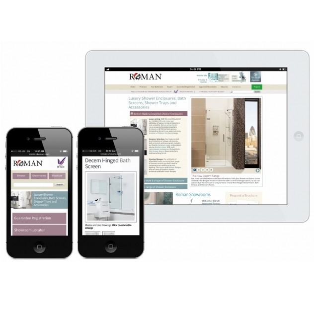
Leading UK Shower Manufacturer, Roman, has launched a mobile version of their website to respond to the growing number of people visiting the site on a mobile device.
This new mobile friendly version provides the user with the ultimate convenience as the website can be viewed on the move.
Roman is the first UK Shower Enclosure Manufacturer to launch a site which has been designed specifically to be compatible with a mobile device.
On entering the Roman mobile website, the user is presented with the most common areas people are most likely to access from their mobile phone, such as: Product Search, Showroom Locator, Brochure Request and Guarantee Registration. All of these key sections of the website are easily and quickly accessible at a click of a button.
Following some extensive research, which showed that around a third of the visitors to the Roman website were from a mobile device, it was the perfect time to create the website optimised for small screen devices such as mobile phones. Over 13% of visitors enjoy the Roman website from handheld mobile devices (purely mobile phones) and a massive 40% of visitors come from tablets and mobile devices.
According to a study, 50% of the average global mobile web users now use mobiles as either their primary or exclusive means of going online. 41% of people have used a mobile device to browse for a product after seeing it in a show or advertisement.
Using this research and their own analytical data, Roman optimised their website to cater for the popular use of mobile devices. It is designed to deliver the mobile version of the site when visiting from a smartphone, but for bigger devices, such as tablets, users will still enjoy the full desktop version of the site.
The manufacturers’ goal is to provide the user with the ultimate convenience, as the website can be viewed on the move. Alongside this, it is easy to navigate, the mobile site mirrors the full website content; it just presents it in an easily digestible way to view on a small screen. In addition, the mobile site has been designed to deliver an exciting and captivating experience for the user without losing information or functionality.
David Osborne, Managing Director at Roman, commented: “After undertaking a considerable amount of research, to find that there is a consistently increasing number of users visiting our website with a mobile device, we wanted to ensure that the experience was as user friendly for them as possible. The thumb friendly links give the user the ability to efficiently find a showroom on the go, watch ‘how to guides’ and videos at a touch of a button, download technical manuals and instructions and upload “Your Bathroom” submissions direct from a mobile phone. The introduction of our new mobile website encourages further use of our website on the go as it is now extremely easy and convenient for the user.”
