Architects and designers SHH have transformed ZSL London Zoo’s main restaurant (The Terrace Restaurant), by remodelling and extending the 1920s building as part of a three-year, £4.6m project.
The restaurant’s capacity has nearly tripled as a result, from 240 to 700 covers (making it one of the UK’s largest day-visitor restaurants), whilst the building’s footprint has also increased by almost 1,000 sq m, to include two expansive terraces and a hugely-increased mezzanine floor area.
“SHH are honoured to join the long list of illustrious architects who have worked with ZSL London Zoo on the creation of new buildings and enclosures over its 187-year history”, commented SHH Creative Director Neil Hogan.
“For our practice, this is an important public building project for us and a strong addition to our portfolio, which has tended historically to feature new-build work in the residential sector, whilst our work in the hospitality sector has been mainly focused on restaurant interiors, on projects such as Café Liberty, the Coach House at Hatfield House and our multi-award-winning Barbican Foodhall and Lounge projects.”
“The existing restaurant at the zoo was updated in order to meet the growing needs of Zoo visitors”, commented SHH Associate Director and Project Leader Brendan Heath.
“As visitor demands increased at the London attraction, the restaurant became in need of increased food storage space and modernised equipment. The new design had to ensure that the restaurant worked as a venue space for special events at the Zoo and also maintained the architectural quality of the original John James Joass building. Above all, our aim was to create a highly-functional and high impact space, which would add real quality to the visitor experience and be able to cope with the huge volume of people coming through the zoo - up to 10,000 per day.”
The project began with a feasibility study, commissioned by ZSL (the Zoological Society of London), looking at catering across the whole site, which also includes various kiosks and a retail and café area within the ‘Animal Adventure Café’. The study, carried out in conjunction with catering consultants Boyd-Thorpe Associates and cost consultants WT Partnership, summarised that the best way forward was to make a major investment in main Regent Building restaurant building, so that it could become a true flagship for the Zoo’s hospitality offer.
When SHH were appointed to the project, they began by assessing the original building, made up of ground, mezzanine and first floor spaces. The 1,196 sq m ground floor offered assisted restaurant service for visitors and a staff canteen area. The 445 sq m mezzanine floor was comprised of a staff
changing area; offices and support space, along with public toilets for the first floor hospitality/ private hire space, the Prince Albert Suite (the interior of which was to remain outside of the brief for the new building). Whilst a 1960s, single storey, timber frame extension at the front (extending just beyond the wings of the original red-brick building) had allowed for increased visitor numbers, it was no longer adequate to cope with the current levels of demand.
“The original building was relatively simple,” commented Brendan Heath. “Its most significant feature was a series of double-height arched windows, which had been covered over in the course of the 1960s extension work, with the addition of a flat roof structure leaving them half-inside and half-outside the building.”
SHH began by demolishing the 1960s extension back to its foundations and creating a brand new tiered extension to the front of the building, increasing the ground floor area with a new 6m-high, double-height space at the front and creating new stairs up to an expanded mezzanine level, a well as a generous new mezzanine terrace deck and a smaller first floor terrace directly above. SHH also built a small extension to the rear of the building to create new storage space for food.
After ripping out a series of suspended ceilings on the ground floor, SHH took the building back to its original structure and revealed three of the original five arched windows, which now link the new extension to the original ground floor space as a dynamic connecting feature, visible from the building’s exterior.
The overall feel of the newly-remodelled building is clean, raw and urban in glass, timber, exposed brick and steelwork columns, with a striking ribbed deck ceiling in the double-height extension. The huge amount of M&E required for the building for air handling, cooling and heating is mainly located in the building’s rear service yard, with a further two air-handling units set within two long, thin plant rooms alongside the building’s wings at mezzanine and first floor levels, clad in Parklex with hidden flush doors. Visually, the plant rooms seem to puncture the floor (although structurally they do not), but they extend a clear visual line up through the two levels.
Externally, soldier course block paving announces the new building and separates it off from the herringbone paving of the external square (Barclay Court). Outside seating and tables are part-canopied by the building’s overhang (in quartz-coloured Parklex) for maximum solar shading. South-facing, full-height curtain wall glazing to the front of the extension is punctured by six 2.5m-tall doors. At the top of the doors, a feature grille in anodised, matt aluminium in silvery grey takes the eye away from the plasterboard of the ceiling above. The grille is also featured along the edge of the mezzanine floor plate as a means of minimising its visual bulk.
At the centre of the glass front to the extension sits a double-sided kiosk with a barista coffee bar and bakery product offer, open throughout the day and a little before the main restaurant opens. The kiosk is also clad in Parklex and folds upwards on opening to create a canopy (specially-created for the project by a company that usually makes doors for aircraft hangars). When closed, it looks to disappear into the building.
Catering in the kiosk and in overall restaurant is operated by Ampersand and features a range of fresh foods, ranging from a dedicated clay pizza oven to hot and cold dishes, all located in a very spacious and roomy layout to the rear of the ground floor. All service stations for the food servery area were created by Design Front, who also created the logo and signage for The Terrace Restaurant at the front of the building.
A newly-refurbished kitchen to the building’s rear has been designed to accommodate the large increase in capacity and includes new canopies, state-of-the-art cooking equipment and two new goods lifts to service all the floors. A new dry food store has also been incorporated into the newly extended rear of the building, along with an office facility for the Zoo’s staff.
“Because of a slight fall away between the front of the existing building and Barclay Court”, Brendan Heath commented, “we wanted to avoid a step upwards or any other barrier to entry and so created the necessary evening-out within the extension itself, with several steps up to the food servery area, together with two ramps for wheelchair and buggy access. Clear means of access and circulation, which the old building lacked, were key in determining the building’s design.”
Steel-framed, cantilevered stairs with glass balustrades for an open feel lead up from both sides of the ground floor to the extensive mezzanine seating area and the terrace beyond, but barely impinge on the stunning, spacious and transparent feel of the building’s interior.
The interior of the front extension features a variety of loose and fixed tables and seating, from oak tables with bar-stool height chairs in vibrant orange to white smaller tables with black and white seating, plus curved ‘S’ shape modular seating, offering ease of access and informal arrangement for families with small children or pushchairs. A smaller area to the left of the ground floor, within the wing section, can be segregated off as needed for meetings or private events, via large sliding partition screens. Flooring is a Solus Ceramic grey ceramic floor tile at ground level with Forbo linoleum for the mezzanine.
In every direction, visual interest is piqued by different building levels, with drama added by the exposed brickwork arches, exposed steelwork columns, huge-scale Artemide light fittings (hung in two rows over the double-height spaces); the huge-scale 35 sq m rooflight, which extends across the whole width of the extension, directly in front of the brick arched original frontage and the stunning ribbed metal-deck ceiling in the extension area, with Troldtekt fibrous timber ceiling tiles, particularly effective for sound absorption, have been for the ceiling areas beneath the mezzanine floor.
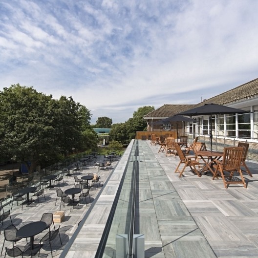
On the mezzanine level, the huge (245 sq m) external terrace features grey ceramic floor tiles in 600 x 600 mm squares from The Deck Tile Company, with a rough finish for safety. A balustrade at the front offers views down onto Barclay Court and into the new penguin enclosure, whilst external deck-mounted lighting washes over the terrace when the lights are low or when the building hosts evening events.
“The internal mezzanine seating area had to fit into quite a tight floor to ceiling height” explained Brendan Heath. “We therefore had to minimise any services that would normally sit within the ceiling space by creating a false wall to the rear of the mezzanine. This only protrudes by 0.5m and is barely perceptible, but this was a better decision than lowering the ceilings further in the only part of the scheme that wasn’t exceptionally spacious.”
On the first floor, the remodelling encompassed a goods lift; further Parklex-clad plant rooms (which act partly as balustrades for the new first floor terrace). The first floor terrace, belonging to the hire-out Prince Albert suite, is set back and offers 215 sq m of space, with a glass balustrade protecting the skylight at its rear edge. Furniture here is in wood and is slightly more traditional than on the balcony below, to marry with the existing Prince Albert Suite look and feel. The new terrace has a composite floor structure, made from a corrugated steel metal tray filled with concrete, which was then sprayed with tanking system insulation and a damp-proof membrane before being tiled in the same ceramic floor tile as the mezzanine terrace below.
